This is a WordPress blog post, that is presented by my blog in the ActivityPub format, so that Mastodon servers (and others speaking the same protocol) can consume it. Pretty cool. I just fixed a bug so now the subject line of the blog post will be the content warning in Mastodon. This means that if I get verbose the wall of text will be behind a click to show more link – there is no 500 character limit in WordPress so you get the full thing. Issue link is over here if you are interested. https://github.com/pfefferle/wordpress-activitypub/issues/191
Well that is enough of the meta-blogging, I will get back to messing about with colourful lights and virtual doorbells. More on that in a future blog post.
This is a further update on my long running theme of air quality in Ireland. I have been looking at ways to do a more detailed survey of the local area air quality to establish where problems are, and what the sources are.
As a bit of background, I have known a little bit about air quality since one of my first jobs 25 years ago involved getting data out of a particle counter for a laboratory clean room over a serial port with an undocumented protocol so that the air could be continuously monitored on a computer from outside the room. The clean room manager seemed relatively pleased with it, and we are now married with three kids. I had mostly forgotten what I knew about particulates, but then I was reminded when people started discussing the air quality in the local area.
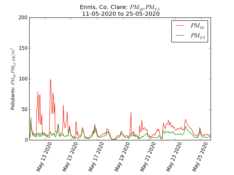
The closest town, Ennis, has some air quality monitoring equipment run by the Environmental Protection Agency, very similar to the clean room monitoring equipment I was familiar with. It measures particulates (microscopic dust) and classifies them by size and calculates how much the particulates contained in each meter cubed of air would weigh. It summarises this in two main categories, particles less than 2.5 microns in diameter, and the weight of particles less than 10 microns in diameter – note that this number includes all of the 2.5 and smaller particles. These two measures are known as PM10 and PM2.5 and they are in units of microgrammes per meter cubed of air. Clean rooms count the numbers of particles rather than the weight, but there are standard approximations on how counts and weights relate to each other. The EPA produced little graphs showing the levels and they jiggle about as expected, there are a few bad days, mostly less than 50 is basically fine, an average below 25 is nice, but overall this looks OK. Room for improvement perhaps, but nothing to get excited about. Generally normal outside air is within a range of 0 to 100 and there are standards based on a 24 hour mean, in that range of 0 to 100.
Then we see stuff like this:
What!! What even is that? How??
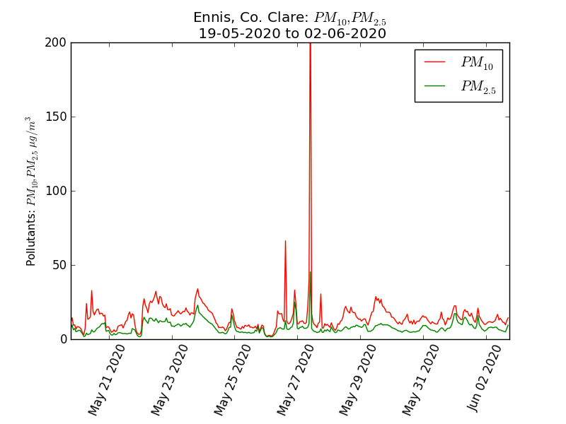
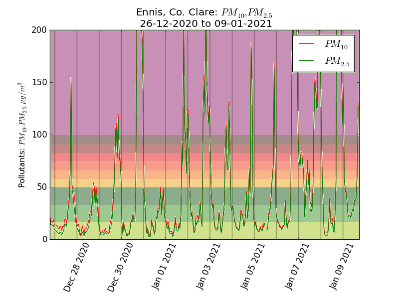
This graph shows a spike in the levels in excess of 200, which I found quite remarkable. This happens a lot and I did some tweaks to the graphs to make them a bit clearer. These spikes happen pretty much every day in the winter. Below is the graph for the last couple of weeks, coloured according to the AQIH levels and with lines to show midnight. The spikes are an evening phenomenon.
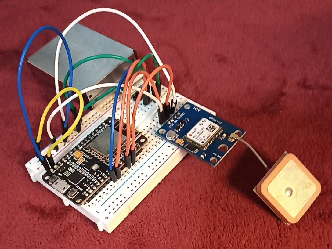
It is these evening spikes I wanted to investigate, not the normal levels, so I have been trying to map out where they happen. I used a few electronic components, the main one is a plantower PMS7003 particle counter. This is relatively cheap (about €20) and sucks in a measured amount of air and uses a small optical sensor to count the particles and classify them into different sizes, it then works out what that amounts to by weight. The next component is a GPS module (€10ish), so I know the position where each particle reading was taken. These components were put on a prototyping plugboard with a microcontroller (any ESP8266 board will do, they cost from about €5) running Tasmota firmware that supports GPS and the sensor.
This was powered from a USB socket in the car and connected over wifi to a laptop running MQTT and Node-RED (all software free and open source) with a simple flow set up to read JSON messages and write them to a file. Reading the file line by line gives a JSON string with the GPS location and all the data from the sensor. Here is a line from the file with the interesting bits highlighted.
This is the cleanest data point, measured somewhere along a rural main road. Zero readings for PM2.5 and PM10 and just 65 particles ≥0.5µm per 0.1 litre of air would be a very good reading to see in an ISO 8 clean room.
That reading taken 25 minutes later, a short distance away in town was definitely not one you would find in any clean room.
Because the readings were so high, the official colour scheme just doesn’t work (it also applies to the 24 hour mean level) so I made my own colour scale based on PM10 values:
Up to 10
This is amazingly clear air, people should visit Ireland just for the privilege of breathing it.
Up to 50
This is fine and normal, we would want a daily average less than 25, but individual readings up to 50 are unremarkable.
Up to 100
This isn’t great, wouldn’t want it to stay here long, we should take action to reduce it.
Up to 200
This is very bad, we should avoid being out in this, it is a public health issue.
Up to 300
Crikey.
300+
Yikes.
I plotted the readings from several evening drives on the map below which you can see full screen here It will change as I add more data points to it, and I might tweak the markers and tooltips a bit.
But why a car?
I wanted to cover a wide area, during the time that these episodes happen. I am not interested in daytime values, or showing a fair representation of typical levels, I am only interested in finding out about the location and extent of the extreme spikes on cold, still evenings. I started by doing a number of tests to see if using a car was viable. The car in question is a big 2007 diesel SUV with a troublesome diesel particulate filter – about the worst possible platform to use in principle.
Starting in an area of very clean air (fluctuating single digit PM2.5 readings) I left the sensor in the car running and stationary with the windows down for 10 minutes or so, it didn’t change the readings (the exhaust drifted up and away). I then drove around my house in circles for 10 minutes or so, it didn’t alter the readings. I then drove around the house backwards several times (not for 10 minutes, reversing gets boring quickly) so that the exhaust would have a better chance of blowing into the car. This moved the numbers up into the teens a few times, but nothing dramatic – I am interested in numbers over 200, and planned to be driving forwards. I then did some driving around the local rural roads in clean air at various speeds, stopping and starting to see if there was any mode of driving that could result in measuring the car rather than the ambient air, and I was unable to find any issues.
The final car test was to check the responsiveness to change, I found a road that went from open countryside to a built up area, with quite a sharp transition in particulate readings, driving up and down from low to high and from high to low I could see that the sensor responded quickly to the change at the same place in each direction – if it took a while for the air to mix in the car then the transitions in each direction would be offset from each other. A little hard to quantify but I would say that responding to changes in air took less than 20 seconds or two readings (two consecutive dots on the map).
I know the sensor works fine in turbulent and windy conditions, I did some tests with a smoke machine and fans when I was thinking of suspending it from a drone and was wondering if the propwash would mess up the readings. I was thinking of putting the sensor in a box strapped to the roof bars, however just putting it on the back seat with the windows down worked perfectly.
But COVID! You are supposed to stay at home
I do mostly, within the 5km for exercise but I have no shops in that area so every few days I make an essential journey to get food. I just go at night when the levels on the EPA monitor are high and I don’t always take the most direct route.
Why didn’t you use Purpleair/Luftdaten/Airbeam?
Those are great, but I wanted full control of the build and data flows. It is also cheaper to get the components rather than buy a productised version in a nice box, but the main reason was to be able to do it exactly how I wanted.
Conclusions and next steps
I will be gathering more data, and I would be very open to having other people doing measurements with similar apparatus contributing to the same map, in the Ennis area or elsewhere. I have some preliminary observations on what I have seen so far:
It isn’t about traffic or fuel choices for vehicles
It isn’t Moneypoint power station or any other distant industrial source
It is a highly localised issue
It is coming from domestic solid fuel combustion
Whilst there is combustion in rural areas the particles don’t concentrate to worrying levels in areas of low density housing, but they do in higher density residential areas.
The issue extends some distance downwind of the built up area.
The point of this is to make change happen, and just looking at the problem doesn’t do that. It does however give a basis for thinking about specific measures that might be effective, and also what things might be a waste of time. More on that in a future article.
I made a little tool that scoops up the official Ireland open data on the Covid-19 outbreak and presents it in a pivot table graphing thing. You can go and have a play with it here https://bumpinto.eu/stats and see the video below on how to use it.
The data comes from the linked data provided by the HSE http://data.geohive.ie/covidData.html my server grabs it daily and processes it from the clever but fairly incomprehensible turtle format into a series of JSON files which are much more practical for analysis. I split the data into a number of datasets, each of which partitions the cases in different ways, so for example one splits up the cases by age, another by county. You can’t add the two together or you double count the cases. We don’t know the breakdown of ages within counties, these are two unrelated ways to partition the number of cases.
The analysis tool is PivotTable.js which is a fantastic open source component that allows you to drag and drop fields into two containers which define the rows and columns of a table. There are dropdowns that allow you to pick an aggregator and metric – you might want to pick the sum of the cases metric but other options are available. The final thing to note is the rendering method, which could be a table, a bar chart, a line chart, some pie charts or a tab separated values table (TSV Export) suitable for copying and pasting into a spreadsheet.
I wrote a thing, go have a play with it at https://bumpinto.eu then pop back to read all about it.
Contact tracing apps are rather a topical subject, we all wish that wasn’t so, but we are where we are. This article discusses a design for such a tool, however this is not a discussion of a practical tool that will be used by anyone. It isn’t an attempt to design an app that people will use, or that governments will want to roll out. This is about designing a privacy maximising solution – or one that leaks an absolute minimum of information to the parties involved. The one that gets rolled out will be very different, but I can’t do anything about that.
The first thing I like to consider when designing something to automate a business process is to look at how we do it now, and how we should do it if computers didn’t exist. Right now the contact tracing process is to ask someone who they have been in contact with for the last few weeks. They remember some of the people they spoke to, and attempts are made to get in touch with and inform those people. The way to improve this as a paper process is for everyone to keep a contact diary. For everyone you meet, you write down who it was. This solves the bad memory problem, and gives a list of people you have had a meaningful contact with. It notably doesn’t include people you were near, but didn’t have meaningful contact with. This is our baseline – the tool we design has to be at least as good as the best paper process we can come up with – and not worse in any disturbing way.
Lets introduce you to our cast of characters. As is traditional in information technology the first people we meet are Alice and Bob. They are two members of the public who have a contact with each other. Some days later one of them will get ill and be diagnosed with coronavirus by Dave who is the doctor in our scenario (we are not allowing self-diagnosis). The final member of the cast is Grace who is the government running a central service to facilitate the process.
Lets first establish a level of trust. Grace is trusted to run the server, but is not to be given any information that can be data mined and exploited in any way. Dave is trusted by Grace to perform diagnosis and tell a patient they need to inform their contacts. Alice and Bob are not really trusted at all, by each other or anyone else.
If Alice and Bob go for 14 days (the presumed maximum incubation period) without getting ill, then nobody, especially Grace, needs to know that they ever met each other. This is key to keeping a massive amount of data away from Grace and also is a vast reduction in the performance requirements of the system. If Alice gets ill and is diagnosed with Sars-CoV-2 then Bob needs to be informed that he has had contact with a person who may have been infectious. He doesn’t really need to know who that person was, just the date on which the contact occurred. Bob can then take whatever steps are appropriate – but we are trusting Bob to do that, there can’t be any enforcement by others.
I have been mulling over how a contact tracing tool could be designed to maximise safety and anonymity, whilst remaining effective and useful. I am, like many others, quite concerned that websites springing up to log your contacts and symptoms are a data harvesting exercise that should be treated with extreme caution. Bad people can do bad things with too much data, and these websites are gathering contact details and medical status of large numbers of people including children. This is not a presentation of a working contact tracing solution for the COVID-19 situation, more of a discussion piece and reference implementation for a type of tool that could be used in future. If this does grow into a functional app, it still won’t be a perfect contact tracing app, it might no be a usable one, it won’t be popular without government support – and popular is important. These things are useless without mass adoption.
The ideal system would have no centrally held data at all about people who are perfectly well and remain perfectly well. It should have a very low barrier to entry – no registration or dependency on having any other form of internet account (Facebook/Twitter/email etc). It should also not keep data beyond what is necessary to function. Users of the system might want to share some details with each other, but an absolute minimum will be shared with the server. The server isn’t to be considered actively evil – it might be government run. The point of the server is to facilitate contact tracing without knowing anything it doesn’t need to know.
Assumptions that I will allow are that everyone using the system has exactly one smartphone, which they have with them all the time, and they will sometimes have an internet connection. The smartphone will have a browser and camera, but may run any operating system so it might not have NFC available.
The system will make extensive use of the indexeddb API. This allows a phone to store and manage data relating to a particular domain without actually sending it to the server. We don’t want much going to the server – it is private until it matters, then it only needs to be shared to the extent that it helps others.
If I am ill, I submit to the server the interactions that may be risky. I may need a diagnosis code from a doctor to confirm – only the doctor would have to be registered with the site, perhaps using a different application. There could be some other process of getting a diagnosis code to a user, such as a letter with a QR code on it.
People might meet other people and want plausible deniability of the interaction – the assumption is that someone else can have full access to your phone and not know who you met, or how many people, but alerts should still function.
There might be a need to record a contact between a person and a place – so for example a shop. This should have deniability – optionally recording nothing about what the place is.
I would rather not have a native app for Android and iPhone – that means people have to go and install it, which is a barrier compared to just visiting a web page and it works. The native app has the dubious advantage of getting access to bluetooth APIs, including the new background contact tracing API that Apple and Google have provided. That essentially does the same thing as the QR code bumping but invisibly and through walls – creating contacts with people you really didn’t have a meaningful contact with.
There is no blockchain involved in any way.
With those requirements in mind, I put a little website together. The front page starts with a QR code and a video from the camera, you point your device at someone else’s QR code and that is it. The interaction is recorded. Job done. You can optionally put some contact details in the QR code, if you want to give the other person your name and number for some reason – it makes no difference to the ability of the contact notification to work but it might give people more of an incentive to use the app. If you are sharing contact details with the person you bump into then you can scan each others QR code, which will be a double bump.
If you become ill you can scan a diagnosis code. This will in principle be something issued by the government via a doctor or perhaps with a test result – control of this prevents people randomly self-diagnosing and scaring their contacts. On scanning the diagnosis code your recent interaction ids will be uploaded to the server, which then makes them available for others to view, to see if they share any of those interaction ids. The server acts as a noticeboard, and it will know how many diagnosis IDs were issued and how many were used but not much else. The server can see how many users are looking at the list of interactions, but has no information about who may share an interaction with someone who was diagnosed.
Current status and next steps
Diagnosis doesn’t fully work, background notifications don’t work, I had to rewrite it from using localstorage to indexeddb so that I can write a service worker to do the background checking of the server and popup notifications. That is coming soon.
I am thinking about interactions with places rather than people. For example, a shop or bus could have a QR code printed out, anyone going in scans the code. If any one gets sick, everyone else who also scanned that place on that day could be alerted and informed which place they went to may have exposed them to some risk – just to be a bit more self aware of potential symptoms. Of course the QR code could contain details of the place, which again could be anonymised if people are going to a place that they might not want to admit to going to if someone examines their phone.
It might be good to allow manual contact entries, so you can make a note of someone you met who for whatever reason didn’t automatically enter via the QR code system. This would be nothing to do with alerting, just a contact diary with entries that evaporate after 14 days, so that you could attempt to contact them if needed, or provide their details to a health authority for followup.
I think it may be interesting to have different types of diagnosis, so you can have self-diagnosis, or diagnosis verified by one or more authorities. This would in principle allow it to work multi nationally, with several testing authorities having the ability to issue diagnosis codes. People being alerted might take different actions depending on the authority that diagnosed the person they have bumped into.
There has been quite a lot of Coronavirus controversy about face masks of various types and who should wear them. There are studies on how much protection a wearer is given from different mask styles, standards and materials, there are studies on what happens to an infected person who wears a mask. There are lots of very strident and certain opinions offered on whether people absolutely should or absolutely shouldn’t be wearing masks. There are not a lot of people with answers to some specific questions I had, so I set out to answer at least one of them.
A mask is a filter of stuff, it isn’t a solid barrier, it will let some stuff through. It works a bit like the way sunglasses filter light. A face mask filters small particles instead of light but the principle is similar. Your sunglasses might have a tint that filters out 70% (typical of category 2 glasses) of the light – letting 30% through to your eyes. If you were to double up the glasses the first pair would let through 30% and the second pair would let through 30% of what got past the first set – so 30% of 30% which is 9% will be let through. The two 70% sunglass filters when used together block 91% of the incoming light – and this works exactly as expected for normal tinted lenses.
If you were to do this experiment with two polarised sunglass lenses instead of plain tinted glasses you will find that your neat maths and logical expectations go very wrong. These don’t randomly filter a percentage of the inbound light, they allow through a non-random polarisation of light. the second glass will either allow through pretty much everything the first one allowed through, or it will block pretty much all of it depending on orientation. I don’t want to go too much into the detail of light polarisation, the point here is that filters can sometimes surprise and not add up in the way you might expect. How do face masks add up? Are they surprising or not?
This is a question that doesn’t appear to have been studied in detail, so I thought I would do a bit of backyard science to find out roughly what we might expect to happen. This is Mythbusters grade science, I have no doubt that people in lab coats with a string of letters after their name will be holding their heads in their hands at the sight of this, but I am still going to get to the same qualitative answer as would be found in more controlled conditions. The setup here is on a pool table in a garage. As it is in a garage it is easy to open the roller door and replace all the air in the room to reset. I have two cardboard packing boxes, Alice and Bob representing a couple of people in a supermarket discussing which one of them should take the last packet of bog roll. Alice is infectious but doesn’t know it as she is asymptomatic. That box contains a smoke machine. Bob is susceptible and contains a particle counter. Each has a mouth cut out facing each other. I can move them back and forward, cover one or both mouths with different materials, and maybe apply positive or negative pressure at various points. I can also give Alice a tap to simulate a cough. The video below shows testing the setup prior to making any measurements.
From just that we can see some interesting things, a cough can form a smoke ring – which may mean that the droplets from a sudden dry cough could travel considerably further than you might expect if they form a stable vortex rather than falling after a certain distance. I don’t know if that is true for real human coughs and I am not going to inhale enough smoke to test it. Regular smokers probably already know how far a cough can travel and whether a smoke ring can be inadvertently formed. It is also possible that if someone coughs at you, your best strategy might be to cough right back at them to prevent theirs from landing! I am not sure this is terribly good advice and an arms race of coughs is probably as sensible as any other escalating arms race.
I tried a few different mask materials and settled on a loosely knitted blanket (the thing I pick up in the video). This is a terrible material as a mask, which means it is ideal for finding out how terrible masks perform. The better mask materials meant more smoke escaped from other places and just wasn’t going to be very informative. The first thing to note is that this terrible mask completely stopped the long range coughs – it let the particles through but they just hung around in a cloud close to Alice. There is no way to form a vortex ring with any mask in place.
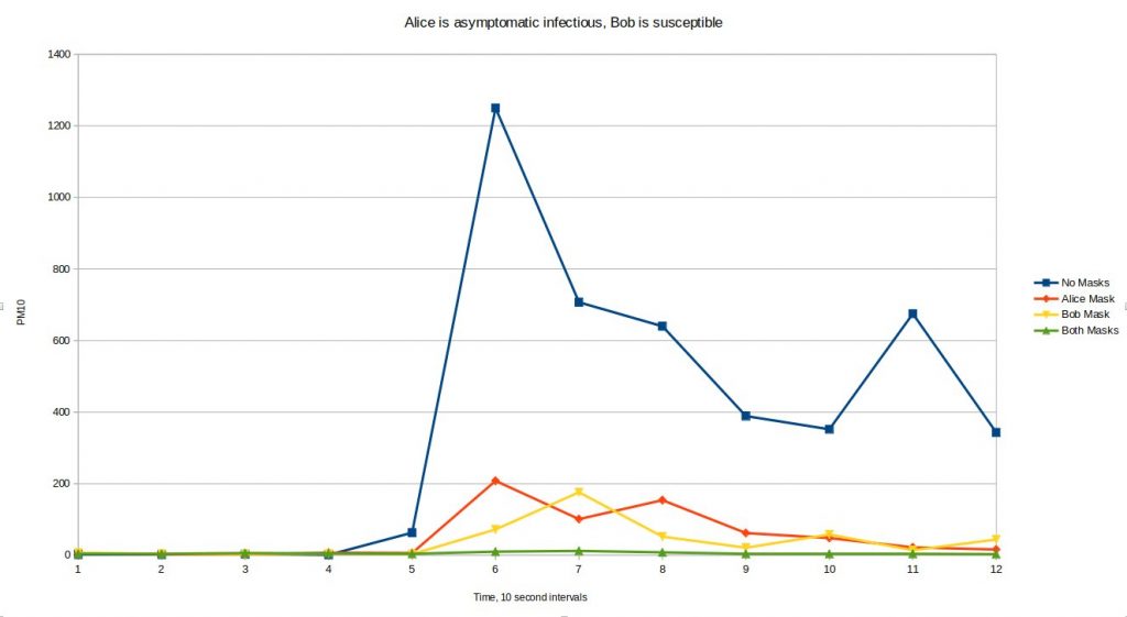
I tested the situation of no masks, a mask for Alice, a mask for Bob and both wearing masks. The graph below is what the particle counter in Bob recorded at 10 second intervals. The start time doesn’t mean much – don’t read anything into which one showed an effect the soonest, but it was roughly 30 seconds generating smoke before it got to Bob. You are really looking at the area under the curve as the amount of smoke seen.
This was just one run of each scenario, followed by refreshing the air to get back down to the single digit background level before trying the next. I will repeat it a bunch of times and see how consistent it is, but on that first run we can see that the single mask is roughly as effective whoever is wearing it (which surprised me a bit, I thought the mask on Alice would be more effective) and two masks is very effective, consistent with masks behaving like unsurprising filters.
I did several more runs it seems that for a 2 minute period the mask blocks around 85% of particles, regardless of who is wearing it. If both wear the mask it blocks around 97%, which is about what would be expected if they are random filters. More testing will be done when the weather conditions are favorable. I would stress that those numbers are not comparable with percentages you will see others quoting for testing different mask materials.
FAQs
But those are not real masks!
Indeed they are not. The mask is intentionally very rubbish as the question is about the addition of two poor quality masks. I used the most porous material I had to hand so that the effect was most testable. Using something like a surgical mask stops the long range cough and it leaks out of the sides. Using an N95 painting mask stops pretty much everything and the smoke leaks out from other parts of the box. Other people have studied different masks, go read their data. All I will say is that a tshirt or cotton sheet was too good to usefully test for the effect I was looking for on the apparatus I put together.
Smoke isn’t droplets!
No, but it isn’t far out, and it isn’t really smoke. The smoke machine turns a water and glycerol based fluid into a cloud of droplets that are in the same ballpark as the size of the exhaled droplets that masks are tested against. They are also perfect for the particle counter.
This should be done in a lab, not a dusty garage!
Yes. Let me know if your results agree with mine when you are done in the lab. My ambient air is very low in particulates, probably cleaner than most city labs.
But the WHO/My local health authority/Someone on the internet insists the public absolutely shouldn’t wear masks!
Great, follow their advice. None of this is advice on what to do, I am just trying to establish whether two masks add up in an expected or unexpected way, which is a question that seemed both reasonable and unanswered.
Bob can get infected from his mask when removing his mask incorrectly!
Maybe so. I don’t attempt to answer that with this experiment, however any particles contaminating Bob’s mask would appear to be particles he would otherwise have inhaled – they are just getting a second chance. The mask doesn’t seem to be something you would expect to be more contaminated than any other article of clothing Bob would be wearing – so if you are treating the mask as a biohazard you should probably treat the rest of his outer clothes the same way.
Should I buy a mask?
Definitely don’t buy a type of mask that could be better used by a healthcare worker. Don’t compete with medical staff for access to that supply chain. This has nothing to do with the experiment, and I am not advising you to do anything in particular, but I am advising you not to take masks that healthcare workers could use.
What type of DIY mask should I make?
I have no advice for you on this, all I am trying to do is give a little objective information on how much joint effectiveness you can reasonably expect from two people wearing masks compared to one of them wearing a mask.
Why on earth do you have a particle counter?
It is for measuring air quality. It isn’t an expensive thing, the component cost around €20 you can get one packaged in a handheld reader for less than €100. I wanted to do my own electronics, so I have a microcontroller reading it and reporting the results over MQTT to my laptop. It is a Plantower PMS7003. I have the smoke machine because everyone needs a smoke machine sometimes.
Do you wear a mask?
I live in the middle of nowhere and I am a champion social distancer. I have a shemagh which is mostly to reduce the number of flies I eat when cycling, but now I keep it over my mouth when going in the shop.
How good do two masks have to be to be the approximate equivalent of a single N95 mask?
The N95 mask has to filter a minimum of 95% of airborne particles. To get to that level with two masks assuming they add up like normal filters the calculation is (1-sqrt(1-0.95)) which works out to about 78% if they are two equal masks. A real N95 mask properly fitted probably performs better than 95%, and two bad masks are not a replacement for one good one in a healthcare setting. This is just a back of the envelope calculation that seems to show a pair of reasonable DIY masks could have a similar joint effectiveness as a standardised mask.
Are their other benefits or drawbacks of wearing masks?
Yes, in particular they may either help to remind you not to touch your face, or they may cause you to adjust them a lot and touch your face more in the process. I have no idea which one happens the most, probably depends on the person. Not really my type of experiment I am afraid.
One of the advantages I was expecting of moving to Ireland was cleaner air. As the winds come across the Atlantic they are pretty clean by the time they arrive, and with a more rural landscape and lower population density things should stay relatively free from pollutants. I was a little surprised to learn that high levels of pollution are being recorded in Ennis, our closest town.
This isn’t ideal, and I wanted to do something about it, encouraging people to move to cleaner heating sources for environmental and health concerns. Then Covid-19 happened. The Coronavirus attacks the respiratory system – that is breathing, it can develop into pneumonia (the “pneu” bit comes from the same roots as pneumatic, it is about breathing). There are very soon going to be a huge number of people right on the borderline between being able to breathe enough, and not being able to breathe enough. Many people will pass that border line and will die. This is the reality of the situation and there is no sugar coating it. There will be too many people to manage in hospital, there won’t be enough ventilators and bottled oxygen, many will manage at home the best they can.
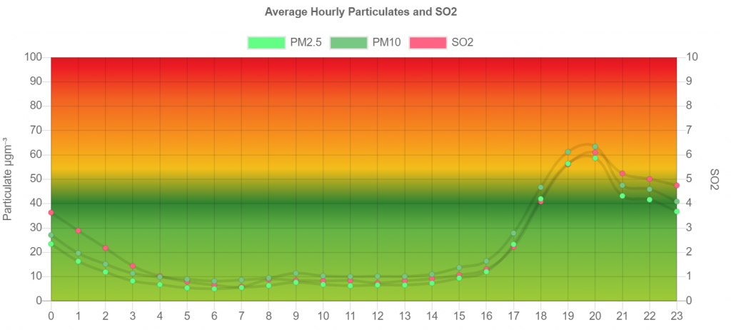
We can all play a part by helping to move that border line a bit by having cleaner air. This is down to all of us because the problem is solid fuel burning in the evenings. No debate, that is the problem. The EPA released some data last year for my local town, I averaged the hourly readings over the course of a month, this is the profile of the average day.
You can see at 9am there is the morning rush hour peak. That is cars. It is tiny. You can see the lack of a daytime problem – that is industry not being too bad. You can see the evening peak when people light the domestic heating fires. The sulpher dioxide rises with the particulates and this very high correlation shows that the particulates go up at the same time as people burn sulpherous materials – notably the smokey coal that some people burn even though they shouldn’t. Even low-sulpher solid fuels produce particulates – even if the smoke is not very visible.
Sometimes the smoke doesn’t disperse, and the levels go very very high. Here is the official graph for the last 14 days, you can see the nightly peaks are very variable. When there is a cold night with low wind speeds we reach levels that are concerning for healthy people. They will tip people with pneumonia over the border line between breathing and never breathing again.
How do we fix it?
Right now, we stop burning solid fuels. Turf, Coal, Wood. I don’t care that it is nice and cozy, I don’t care that it is traditional. We can argue about whether to use them again next winter. We can even argue about climate change one day in the future. Right now we have to stop. Get and use an electric heater if you need secondary heating, I don’t care if you think it might cost a little more in the electric bill than you spend on fuel (it probably won’t, but it isn’t even up for discussion right now). If you end up with a fever you might well want the house toasty warm. Please please right now, source electric heating options before you are desperate to light the fire.
If you or anyone you know is using a solid fuel range for cooking there are electric induction hobs that work very well. Pizza ovens, BBQs, fire pits. Chimneas etc all must stop. Not needed.
It isn’t a “fossil fuel” issue, gas and oil heating and cooking is fine, don’t worry about that right now. It is about solid fuel that doesn’t burn cleanly, and all the people who will be on the border line.
In the longer term . . .
Now follows the rest of the article I was working on for normal times, you can stop reading now if you like. Go out and buy a heater.
I am working on some DIY monitoring of particulate levels, I was going to do a heap more graphs and diagrams and evidence gathering, along with some fun 3d smoke simulations using blender showing the effect of wind speed and temperature inversions etc. Maybe I will do another article on that later.
Please don’t burn stuff in town on evenings when it is not windy. Get an electric oil filled radiator and use that as a secondary heating source if you need more than oil or gas central heating can provide.
I can’t afford to buy an electric heater
Oil filled radiators were sold in Aldi for €20. That is the equivalent of 4 bundles of Bord na Móna briquettes. They can be found for a little more in other places. No need to spend more than €40.
Which type of heater or power output is cheapest to run?
It doesn’t matter. Not even a little bit. They have a thermostat, and cut out when they reach that temperature. A 1000W heater and a 2000W heater will both use the same amount of energy to warm and maintain a room at a set temperature. The more powerful one (or a fan heater) might get there a bit quicker, and the less powerful one might maintain a more steady temperature but both will use the same energy to do the same task. A fan heater, or old style glowing bar heater (with a thermostat) would also use exactly the same energy to warm the same room to the same temperature. I recommend not using a fan heater as I have seen one start a fire when accidentally covered. Oil filled radiators (which you also shouldn’t cover) seem a lot safer.
Is electric heating more expensive than burning turf/wood/coal?
Yeah, a bit. The priority for health is to not burn solid fuel on the days when the pollution accumulates. If if is blowing a hooley out then a nice warm fire is fine (at least on health grounds for the area – it isn’t very eco friendly at any time)
Should I turn off appliances when the heater is on to save electricity?
No, the opposite! Turn the telly on, do some ironing, dry your hair, turn on all the lights! Almost all appliances end up sending waste heat into the room – but if you are heating the room with electric then there is *no* waste heat – you are using it. Everything you use is just reducing the load on the heater and the thermostat will turn it off a bit sooner or keep it off for longer. While you have a thermostatically controlled electric heater on, all appliances are free to use (or the cost of using them reduces the cost of running the heater by the exact same amount). The exceptions to this are vented tumble dryers that throw hot air out of the house, and washing machines and dishwashers that put warm water down the drain.
This “appliances are free when the heat is on” theory is slightly less true when using cheaper heat sources such as central heating or an electric heat pump. It would be more true if using a more expensive heat source than electric – but why would you do that?
Doesn’t this just mean a power station somewhere is burning stuff?
Yes, but the power station can burn things a *lot* more cleanly and efficiently than you can. They can have scrubbers in the very tall chimney to control what exactly is being emitted. Some of your electricity will come from renewables or clean burning combined cycle gas turbine power stations. They are also not burning stuff in town where the people are, most of the particulates will settle out on farmland or disperse into the atmosphere and maybe end up falling with rain.
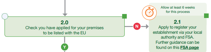
This is something I have been concerned about for some time now. Last week it was announced that the PAFF committee had given a favourable view on a commission implementing decision to “list” the UK and allow the UK to export food and feed of animal origin into the EU. That is not really the end of the story though, because once the country is listed (and it isn’t listed until exit day, they have just decided to list it) that means that the three competent authorities (The FSA will be the competent authority for England and Wales, DEARA for Northern Ireland and FSS for Scotland.) can start to submit lists of establishments. This takes 20+10 working days for a two step notification process where the proposed change is circulated to member states, then published before imports may be accepted from those establishments. The UK agrees with this timeframe if you look at the guidance on exporting and also the flowcharts where the listing step needs to “allow at least 6 weeks”.
It wasn’t quite clear to me if the two periods could be overlapped or if there was any plan to shortcut the whole process for Brexit, so I asked:
Concerning Article 12 4. (b) of regulation 854/2004
“If no Member State objects to the new or updated list within 20 working days of the Commission’s notification, imports shall be authorised from establishments appearing on the list 10 working days after the day on which the Commission makes it available to the public.”
Is it possible for the 20 days and 10 days to overlap? So in the Brexit scenario the lists provided by the UK could go to member states, then provisionally be made available to the public after the first 10 working days and then the 10 day period and 20 day period would end on the same day so that imports to the EU from the UK could happen from 20 days after their competent authorities submit lists of establishments.
Today I got a reply:
Dear Alan Bell,
Thank you for contacting the Europe Direct Contact Centre.
When there is a request for a modification to the Non-EU country establishments list and there are no objections from any of the EU countries within 20 working days to these requests, the new draft list is published on the DG SANTE website.
In other words, the commission first notifies the competent authorities of the member states, which have 20 days to object. After these 20 days pass without objections, the list is also made available to the public. 10 days after the publication, the imports from the authorised establishments can take place.
We hope you find this information useful. Please contact us again if you have other questions about the European Union, its activities or institutions.
So there will be no exports of food or feed of animal origin until halfway through December unless something happens between now and then to solve this problem.
Earlier this week Minister George Eustace lied to a House of Commons committee and told them that there would be no trouble on day one as country level listing had been approved. He didn’t disclose the fact that establishments need to be listed and that there is a statutory timescale for that. There doesn’t appear to be anything in the withdrawal agreement that would lead to this requirement being waived, so even if the withdrawal agreement is voted through it appears that no establishments in the UK will be authorised to export any products of animal origin.
The government of the United Kingdom is getting in a right mess over Brexit now. Parliament has passed a law, known as the Benn act which was intended to prevent a no-deal departure. Prime Minister Johnson describes this as a surrender act because his jingoistic base likes to use the terminology of war, and he wants something else to blame for his failures. The act is designed to force the prime minister to request an extension to the article 50 negotiation period, and it goes down to the detail of writing the letter for him. There are court proceedings in Scotland trying to establish whether the Benn act is watertight. I don’t think it is.
In general the Padfield principle stops ministers from circumventing or frustrating an act of parliament. They have to stick to the letter of the law and the spirit of the law. I don’t think that applies to the scenario I am thinking of.
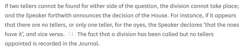
Last month something curious happened when passing the Benn act. An amendment was proposed by Stephen Kinnock, the government was going to vote against it and there was only weak support for it from the opposition. A division (vote) was called and 633 MPs were all set to waste 15 minutes of their day traipsing through the division lobbies (that is around 4 person-weeks of parliamentarian effort per division) when something really odd happened. There were no tellers for the noes. The government had failed to put forward two people to verify the count, so the ayes won the division by default. This is how it works according to the Erskine May rule book.
The exact effect of the Kinnock amendment isn’t terribly important, the government was experimenting with throwing in the towel on a division on a topic that didn’t matter too much to them, just to check it would work. It did.
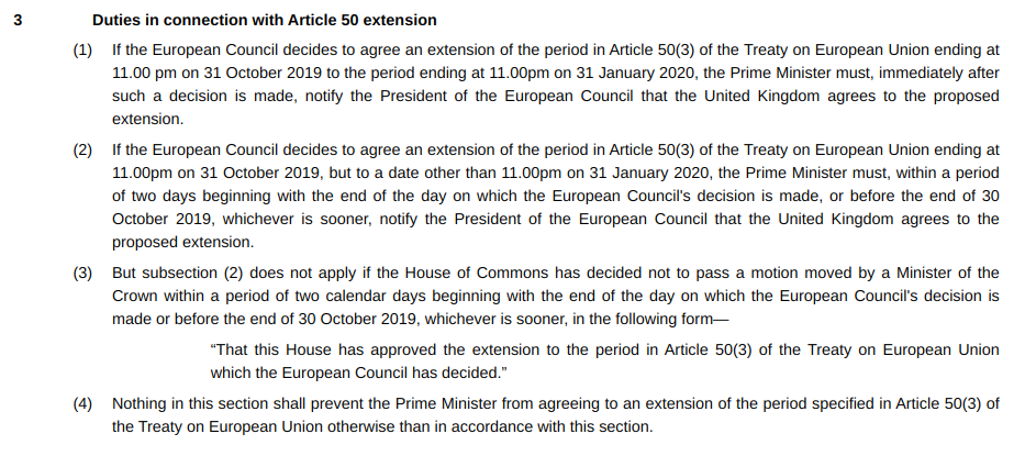
Lets have a look at that Benn act, and what happens after the extension request has been forced. For this we need to read section 3.
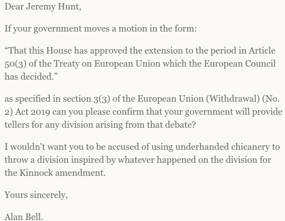
It is quite likely that the EU council will propose some other extension date. Maybe March 29th because we have done one of those before. Maybe they will pick a date that just makes a bit more sense for some obscure accounting reason. It doesn’t matter. All that matters is that some other date is picked so that we activate (2) and (3). The government can (and will) have a minister of the crown move a motion within two days “That this house has approved the extension to the period in Article 50(3) of the Treaty on European Union which the European Council has decided.”
This will be a government motion (moved by a minister) and as such the government would be expected to put forward two tellers for the vote. They have already established a solid precedent, during the approval of this very act, that the government can fail to provide tellers in order to throw a division that it would otherwise have won easily. The result of the division is recorded as a decision of the house. Such a decision seems wrong, but it is no less a decision than any other vote taken – we saw it pass an amendment into primary legislation. Overturning a division of the House of Commons is not something the courts can do, even if they think they should. Having decided not to approve the motion the government is then released from the obligations in section (2) and a no-deal Brexit awaits.
Buckle up.
I did ask my MP (yes, I can still write to the MP where I was last resident in the UK) to confirm that the government won’t do this. I will update this post with any reply.
Ways to avoid this: Firstly the EU could agree to the 11PM January 31st deadline. Then this scenario doesn’t arise (maybe some other one will, but this one doesn’t) as the government is automatically obliged to accept the extension.
It might be possible for tellers to be provided anyway. The process of choosing tellers is not exactly transparent, I don’t know if the opposition whips can leap in and provide tellers, or if the speaker can just pick a couple of MPs who are loitering in the chamber. All I know is that neither of these things happened for the Kinnock extension – but motivations might be a little sharper this time.
It might be possible to amend the motion, although I don’t entirely see how this helps.
Something might happen before we get there, relating to the Queens Speech or some other shenanigans that prevents the extension request (most shenanigans would end up in court and Padfield would be cited).
It was Lindsay Hoyle in the chair at the time of the Kinnock amendment (a deputy speaker does the committee stage) so maybe Bercow would have a different approach. You can watch the video of the event here. The confusion carries on into the next vote as MPs were in the lobby and didn’t know the division was off.
I wrote to my MP a while back (when I was still living in the UK) about settled status, I had been monitoring the stream of Henry VIII power statutory instruments and spotted a bit of a problem.
This instrument was prepared by the Department for Exiting the European Union and it removes the directly effective treaty right that enables EU27 citizens to be provided with consular assistance at our embassies in the event that their member state does not have an embassy.
The natural consequence of the decision of the 52% to do Brexit is that UK citizens will no longer be able to get consular assistance from EU27 embassies and vice versa. This is as expected and is harmful to both sides, but throwing away the reciprocal benefit can only be the desired result.
The error that is being made in this statutory instrument is to fail to consider the situation of people with settled status. A person with settled status in the UK should be afforded consular assistance from UK embassies wherever they are in the world without having to rely on their home state having a diplomatic presence. Failing to provide continuing consular assistance to people with settled status does not live up to the promises that their rights will be preserved after implementing a Brexit.
Yours sincerely,
Alan Bell
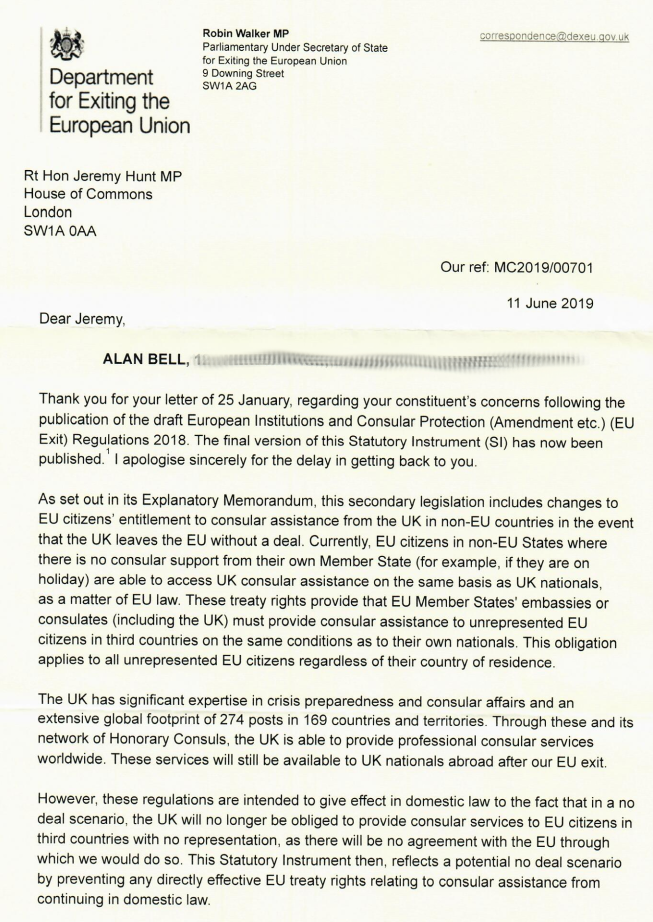
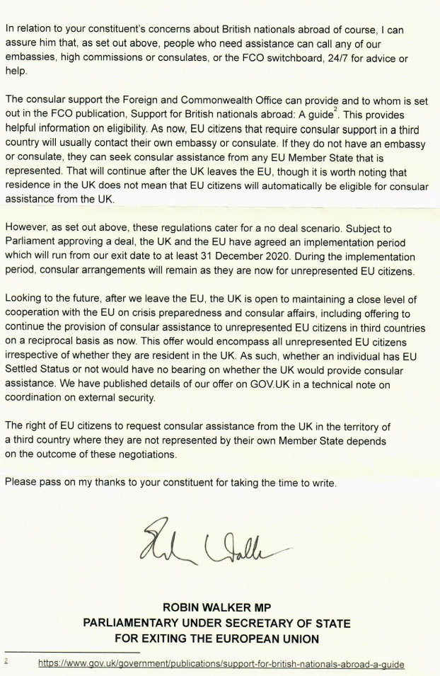
He passed it on to Robin Walker, and I received this reply today:
So, nothing special for people with settled status, but the UK is considering offering consular assistance to all unrepresented EU citizens – on a reciprocal basis. Can the EU even offer that? Did it even come up in the negotiations?
This is a bit of an edge case, there probably is no country where there is a UK embassy but no other EU27 embassy, so people with settled status will be able to ask for assistance at an embassy – but not the UK embassy, because settled status does not preserve that right.
The Tory psychodrama now moves into the next phase, some will do interviews on radio, some will do interviews on television, some might do interviews under caution.
All very entertaining, but we are not the electorate and are not involved in the process in any way. There will be a number of rounds of votes, the bottom few will be eliminated each round and some may strategically drop out just prior to actually losing a vote in an vain effort to keep their political career untarnished. At the end the last two candidates will go to a ballot of Tory members, and I can’t be bothered to make disparaging remarks about the demographics – it is all sorts of Tories and it doesn’t matter for the next bit. One will come first, the other will come second. Lets indulge in a little thought experiment on how things might play out from there.
When the process is complete Theresa May who is the Prime Minister will remain the Prime Minister until she can make a clear recommendation to the Queen about who should be invited to form a government that can command a majority of the House of Commons. I was quite precise with the wording there, it is set out in the cabinet manual which you can read. The vote of confidence happens after the new person is invited to try to form a government. Theresa May has to make a clear recommendation based on whatever information she can base it on, but that will not include a vote of the House of Commons. It looks highly dubious that any candidate can keep the DUP and all factions of the Conservatives on board.
Lets say a hypothetical outcome is that Boris Johnson and Rory Stewart are the last two that go to the membership. Boris wins. There is no way he can command a majority in the house. Lets imagine that the SNP and/or Labour decide that now isn’t really the time for a General Election, however they decide to let Rory have a go for a while and announce that they will support him in confidence motions until an early General Election in May 2020. In that scenario May’s clear recommendation to the Sovereign has to be to ask Rory Stewart to form a government. The democratic vote of the Tory membership means nothing – the opposition can pick whatever candidate they like (even one that doesn’t make the last two), or cause a general election.