This is a further update on my long running theme of air quality in Ireland. I have been looking at ways to do a more detailed survey of the local area air quality to establish where problems are, and what the sources are.
As a bit of background, I have known a little bit about air quality since one of my first jobs 25 years ago involved getting data out of a particle counter for a laboratory clean room over a serial port with an undocumented protocol so that the air could be continuously monitored on a computer from outside the room. The clean room manager seemed relatively pleased with it, and we are now married with three kids. I had mostly forgotten what I knew about particulates, but then I was reminded when people started discussing the air quality in the local area.
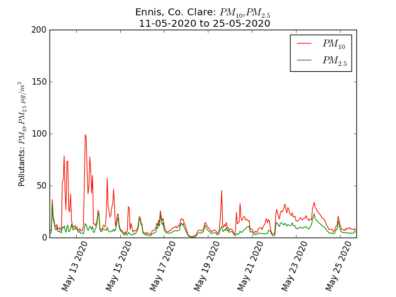
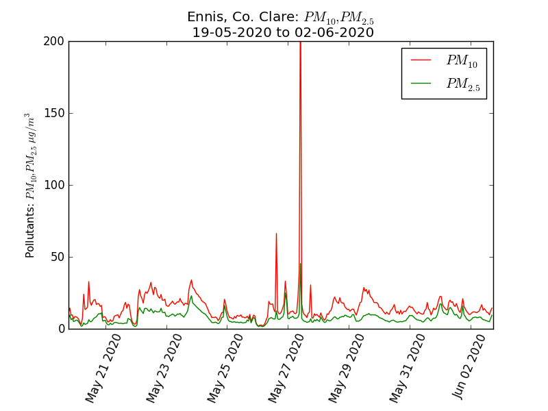
The closest town, Ennis, has some air quality monitoring equipment run by the Environmental Protection Agency, very similar to the clean room monitoring equipment I was familiar with. It measures particulates (microscopic dust) and classifies them by size and calculates how much the particulates contained in each meter cubed of air would weigh. It summarises this in two main categories, particles less than 2.5 microns in diameter, and the weight of particles less than 10 microns in diameter – note that this number includes all of the 2.5 and smaller particles. These two measures are known as PM10 and PM2.5 and they are in units of microgrammes per meter cubed of air. Clean rooms count the numbers of particles rather than the weight, but there are standard approximations on how counts and weights relate to each other. The EPA produced little graphs showing the levels and they jiggle about as expected, there are a few bad days, mostly less than 50 is basically fine, an average below 25 is nice, but overall this looks OK. Room for improvement perhaps, but nothing to get excited about. Generally normal outside air is within a range of 0 to 100 and there are standards based on a 24 hour mean, in that range of 0 to 100.
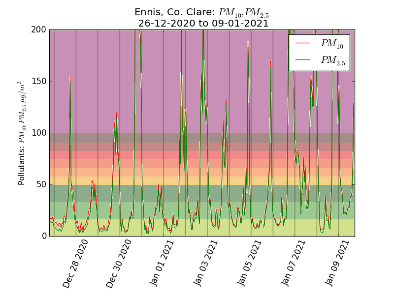
Then we see stuff like this:
This graph shows a spike in the levels in excess of 200, which I found quite remarkable. This happens a lot and I did some tweaks to the graphs to make them a bit clearer. These spikes happen pretty much every day in the winter. Below is the graph for the last couple of weeks, coloured according to the AQIH levels and with lines to show midnight. The spikes are an evening phenomenon.
It is these evening spikes I wanted to investigate, not the normal levels, so I have been trying to map out where they happen. I used a few electronic components, the main one is a plantower PMS7003 particle counter. This is relatively cheap (about €20) and sucks in a measured amount of air and uses a small optical sensor to count the particles and classify them into different sizes, it then works out what that amounts to by weight. The next component is a GPS module (€10ish), so I know the position where each particle reading was taken. These components were put on a prototyping plugboard with a microcontroller (any ESP8266 board will do, they cost from about €5) running Tasmota firmware that supports GPS and the sensor.
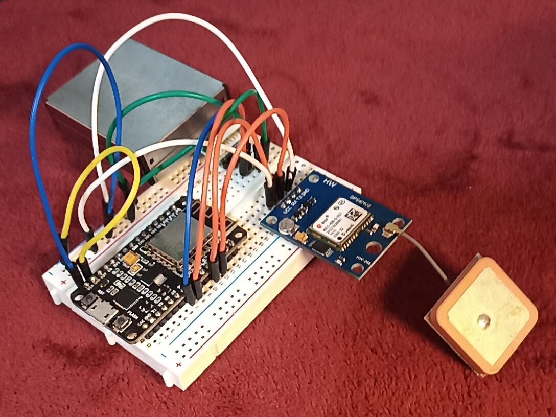
This was powered from a USB socket in the car and connected over wifi to a laptop running MQTT and Node-RED (all software free and open source) with a simple flow set up to read JSON messages and write them to a file. Reading the file line by line gives a JSON string with the GPS location and all the data from the sensor. Here is a line from the file with the interesting bits highlighted.
{“Time”:”2021-01-07T20:00:58″,”PMS5003″:{“CF1″:0,”CF2.5″:0,”CF10″:0,”PM1”:0,“PM2.5″:0,”PM10”:0,”PB0.3″:312,”PB0.5″:65,”PB1″:0,”PB2.5″:0,”PB5″:0,”PB10″:0},”GPS”:{“lat”:52.8639490,”lon”:-9.0528769,”alt”:96.158,”hAcc”:10.465,”vAcc”:10.903},”FLOG”:{“rec”:0,”mode”:0,”sec”:0}}
This is the cleanest data point, measured somewhere along a rural main road. Zero readings for PM2.5 and PM10 and just 65 particles ≥0.5µm per 0.1 litre of air would be a very good reading to see in an ISO 8 clean room.
{“Time”:”2021-01-07T20:26:28″,”PMS5003″:{“CF1″:238,”CF2.5″:367,”CF10″:462,”PM1”:157,“PM2.5″:244,”PM10”:307,”PB0.3″:28188,”PB0.5″:7917,”PB1″:1566,”PB2.5″:224,”PB5″:95,”PB10″:30},”GPS”:{“lat”:52.8467752,”lon”:-8.9877348,”alt”:63.534,”hAcc”:10.394,”vAcc”:8.580},”FLOG”:{“rec”:0,”mode”:0,”sec”:0}}
That reading taken 25 minutes later, a short distance away in town was definitely not one you would find in any clean room.
Because the readings were so high, the official colour scheme just doesn’t work (it also applies to the 24 hour mean level) so I made my own colour scale based on PM10 values:
| Up to 10 | This is amazingly clear air, people should visit Ireland just for the privilege of breathing it. | |
| Up to 50 | This is fine and normal, we would want a daily average less than 25, but individual readings up to 50 are unremarkable. | |
| Up to 100 | This isn’t great, wouldn’t want it to stay here long, we should take action to reduce it. | |
| Up to 200 | This is very bad, we should avoid being out in this, it is a public health issue. | |
| Up to 300 | Crikey. | |
| 300+ | Yikes. |
I plotted the readings from several evening drives on the map below which you can see full screen here It will change as I add more data points to it, and I might tweak the markers and tooltips a bit.
But why a car?
I wanted to cover a wide area, during the time that these episodes happen. I am not interested in daytime values, or showing a fair representation of typical levels, I am only interested in finding out about the location and extent of the extreme spikes on cold, still evenings. I started by doing a number of tests to see if using a car was viable. The car in question is a big 2007 diesel SUV with a troublesome diesel particulate filter – about the worst possible platform to use in principle.
Starting in an area of very clean air (fluctuating single digit PM2.5 readings) I left the sensor in the car running and stationary with the windows down for 10 minutes or so, it didn’t change the readings (the exhaust drifted up and away). I then drove around my house in circles for 10 minutes or so, it didn’t alter the readings. I then drove around the house backwards several times (not for 10 minutes, reversing gets boring quickly) so that the exhaust would have a better chance of blowing into the car. This moved the numbers up into the teens a few times, but nothing dramatic – I am interested in numbers over 200, and planned to be driving forwards. I then did some driving around the local rural roads in clean air at various speeds, stopping and starting to see if there was any mode of driving that could result in measuring the car rather than the ambient air, and I was unable to find any issues.
The final car test was to check the responsiveness to change, I found a road that went from open countryside to a built up area, with quite a sharp transition in particulate readings, driving up and down from low to high and from high to low I could see that the sensor responded quickly to the change at the same place in each direction – if it took a while for the air to mix in the car then the transitions in each direction would be offset from each other. A little hard to quantify but I would say that responding to changes in air took less than 20 seconds or two readings (two consecutive dots on the map).
I know the sensor works fine in turbulent and windy conditions, I did some tests with a smoke machine and fans when I was thinking of suspending it from a drone and was wondering if the propwash would mess up the readings. I was thinking of putting the sensor in a box strapped to the roof bars, however just putting it on the back seat with the windows down worked perfectly.
But COVID! You are supposed to stay at home
I do mostly, within the 5km for exercise but I have no shops in that area so every few days I make an essential journey to get food. I just go at night when the levels on the EPA monitor are high and I don’t always take the most direct route.
Why didn’t you use Purpleair/Luftdaten/Airbeam?
Those are great, but I wanted full control of the build and data flows. It is also cheaper to get the components rather than buy a productised version in a nice box, but the main reason was to be able to do it exactly how I wanted.
Conclusions and next steps
I will be gathering more data, and I would be very open to having other people doing measurements with similar apparatus contributing to the same map, in the Ennis area or elsewhere. I have some preliminary observations on what I have seen so far:
- It isn’t about traffic or fuel choices for vehicles
- It isn’t Moneypoint power station or any other distant industrial source
- It is a highly localised issue
- It is coming from domestic solid fuel combustion
- Whilst there is combustion in rural areas the particles don’t concentrate to worrying levels in areas of low density housing, but they do in higher density residential areas.
- The issue extends some distance downwind of the built up area.
The point of this is to make change happen, and just looking at the problem doesn’t do that. It does however give a basis for thinking about specific measures that might be effective, and also what things might be a waste of time. More on that in a future article.
Thanks for the write-up. We need to clone you so the air quality in more areas can be investigated 🙂
@alanbell@westbrit.ie testing a reply which should make a comment